Bed Bath & Beyond

  • Here I worked closely with the EVP and VP of the company to recreate the look and feel of Bed Bath & Beyond’s current registry app screens.

  • I lead the process of re-design (roughly 80 screens) for the new registry design.

  • My first step was creating a new design system to build consistency in the proposed design across all new screens. Below is a glimpse of the design system essentials.

Design System

Understanding the spacing and grid across all screens.

Atoms

Using the atomic design molecules to build the rest. The atoms ranged from buttons to icons- these laid the foundation of all the designs

Molecules

The next step was to use these molecules to build molecules organisms and so on. Below are few molecular structures that included nav bars, product tiles, etc

App Landing Page

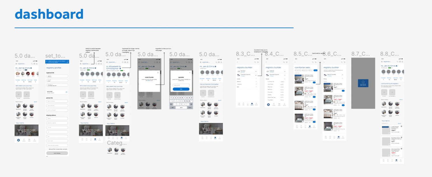
The next step was using the new design system to make new registry flows. These are the design for the newly proposed dashboard. Which will be the entry point of the registry app. The first step was designing the landing page for users who arrive at the registry tab. This included creating a profile of each type of registry like wedding, baby, college and housewarming

Flow 1

The quickest 3 field create flow.

You're required to add only 3 fields of information. This is unlike any competition in the market making it the fastest signup process.

Flow 2

Dashboard
The goal here was to remove all clutter and keep only the most relevant information on the dashboard. The decision on
the most relevant content was taken in collaboration with all stakeholders.

Flow 3

Add item to registry

This was proved to be more discoverable, quick and delightful.

Flow 4

Find a registry

The second feature on the landing page is to find an existing registry.

States & Models

The next step was making all states and modals for the flow